3 Quick and Easy Ways To Improve Your Photography

You’ve all heard me go on and on about the importance of photography within branding and story telling (but if you haven’t, read this post!). Now, I fully encourage brands to use professional photographers where they can to create their visual communication, however, I know that isn’t always possible, so here are three really simple things you can do to improve your photography (even if you’re shooting with your iPhone)!
1. Remove Distractions:
After you’ve set up your shot, be it a table display, or your flat lay, stand back and take a look. Maybe even take a few images and see how it looks on camera. Is there anything that’s really distracting, or drawing the away away from the main area of interest? I’m always drawn to images which are simple and clean, so removing excess clutter is a winner.

In this first image, the flowers on the top right aren't really adding anything, and the lone flower on the right hand side looks a bit lonely. They don't add anything to the image.

In this shot (which ended up being the image I used for this blog post) feels less cluttered. The plant in the top right is less distracting, but adds a nice pop of green, and by pulling the flowers on the right slighly out of frame and pairing them with another, they look less out of balance.
2. Think About The Light:
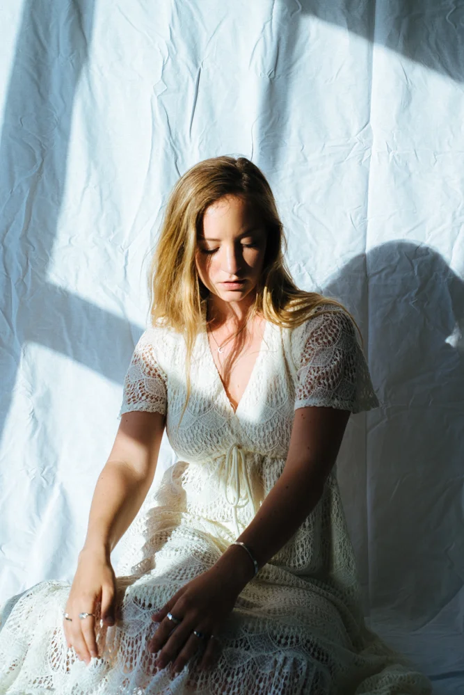
Light is everything in photography. I’ve spent years studying it, and I’m now such a light geek that I can sit in our living room and just watch the sun change the way the room looks as the hours go by. When you’re shooting, take a step back and think about how the light is falling on the subject of your image. If you’re photographing a model, are the shadows flattering? Are any areas of importance in dark shadow? One great tip that I can give you for almost always strong imagery is to keep your subject at a 90° angle to the window light. If you’re experiencing super dark shadows on one side, grab a white piece of paper or a white sheet and hold it up next to it. You’ll bounce that light back in, and reduce those harsh, unflattering shadows. Easy!

In this self portrait, although its a nice image, the shadows on the left of my face aren't particularly flattering. My nose isn't very big, yet this shadow cast by the low sunlight is making it look rather large!

What a difference a slight change in angle can make! By moving my face further towards the light, I've still got that moody, constrasty shadow going on, but the features on my face aren't being ruined by the shadows.
3. Composition Is Key:
I don’t truly believe that you need to stick to rules about composition…sometimes breaking the rules makes for a much stronger image than if you were to stick to them! However, crops can be extremely powerful tools. Negative space is great for giving the eye somewhere to rest. I also love to refer to the rule of thirds. Simply place your subject matter anywhere where the lines cross (see below) and you’ll almost always have a visually appealing image. But like I said, feel free to play around with crops - that’s one of the biggest advantages of digital imagery - you can play until your heart is content!


These two images are quite good examples of how I've utilised the rule of thirds. For a lot of people, this happens naturally, and it isn't something you need to think about that often, but maybe in future you'll be able to notice it more often, and pick out what it is you like about images, and know why!
So what are you waiting for? Grab your iPhone, and get snapping! Share your images with me on Instagram by tagging me in them @oliviabossert

